AquaGrammar Help
Tutorial
This is the slow version. Getting started gets you a chart in a few minutes; this page explains what you are doing at each step, so that the chart means something when it appears.
Work with Demo 1 — Natural Systems. It is bundled, so nothing can go wrong that you cannot undo by starting over.
What you will be able to do
- Produce a Classic-12 Aquagram® from a MicroNIR file
- Explain what SNV, standardization, and repeat averaging did to your data
- Decide when to use Average, Add, or Subtract
- Read the chart without over-claiming what it shows
- Export results in a form you can use elsewhere
Step 1 · Open a file
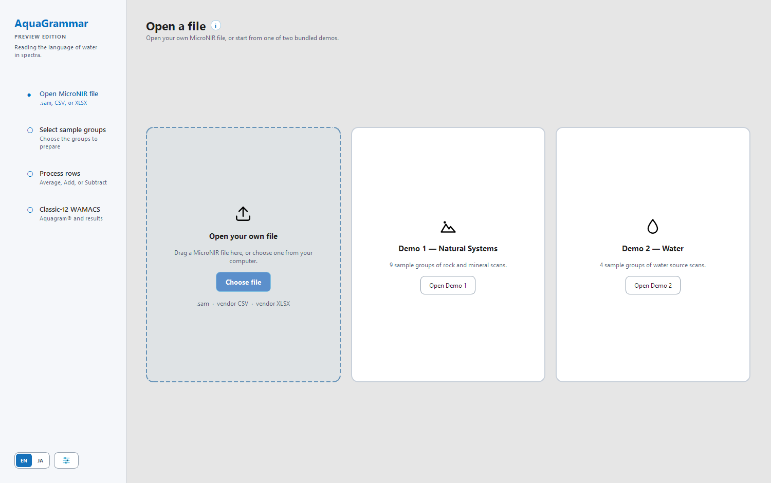
Select Open Demo 1. The file loads and AquaGrammar moves to step 2.
What just happened. AquaGrammar read a spreadsheet of spectra. Each row is one scan: a sample name, then an absorbance value at each wavelength. Nothing has been altered yet.
Notice the four steps down the left. They stay visible the whole time, and completed ones get a tick. You can click back to any of them without losing your work.
Step 2 · Select sample groups
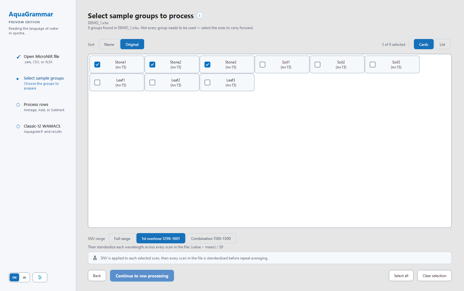
Demo 1 contains nine groups. Each shows a repeat count: Stone1 (n=15) means Stone1 was scanned fifteen times.
Tick Stone1, Stone2 and Stone3. Leave the rest unticked — they will be excluded entirely.
Why groups matter. A single scan carries measurement noise. Scanning the same sample repeatedly and averaging those repeats is what makes the result worth looking at. AquaGrammar does that averaging for you, but only within each group, so the groups must be right before you continue.
Choosing the SNV range
Below the list, choose 1st overtone 1300–1600.
The twelve Classic-12 coordinates all sit between 1342 nm and 1512 nm — that is, inside the 1st overtone band. Normalizing over that range means each spectrum is scaled by the region you are about to plot, rather than by wavelengths that never reach the chart. Full range and Combination 1100–1300 are available for comparison work.
Select Continue to row processing.
What just happened. Three things, in order, with no options to set:
- SNV was applied to each selected scan over your chosen range. This removes differences in overall brightness between scans, so that scans can be compared by shape rather than by level.
- Standardization put every wavelength on the same footing across every scan in the file, as
(value − mean) / SD. - Repeat averaging collapsed each group's repeats into one row.
Step 3 · Process rows
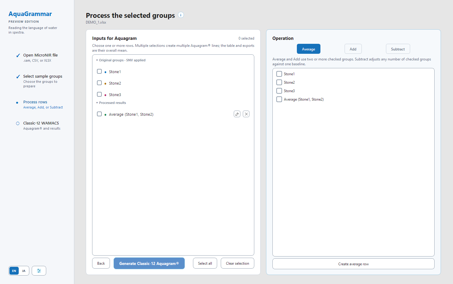
The left panel lists your three prepared groups under *Original groups · SNV applied*, each with a coloured dot — the colour its line will take.
You could tick all three now and plot them. Instead, try an operation first, so you can see where processed rows come from.
On the right, with Average selected, tick Stone1 and Stone2, then select Create average row. A new row appears on the left under *Processed results*, named after what made it.
The three operations
- Average — the mean of two or more groups. Use it when the groups are replicates of the same thing and you want one representative line.
- Add — the sum of two or more groups.
- Subtract — pick any number of groups to adjust, plus one baseline, and get one result per adjusted group. Use it to ask *how does each of these differ from that reference?* Subtracting a group from itself gives zero, which is a useful sanity check.
A processed row is not a dead end: rename it with the pencil, delete it with the ×, or use it as an input to another operation.
Step 4 · Read the Aquagram®
Tick the rows you want to plot — try Stone1, Stone2 and Stone3 — then select Generate Classic-12 Aquagram®.
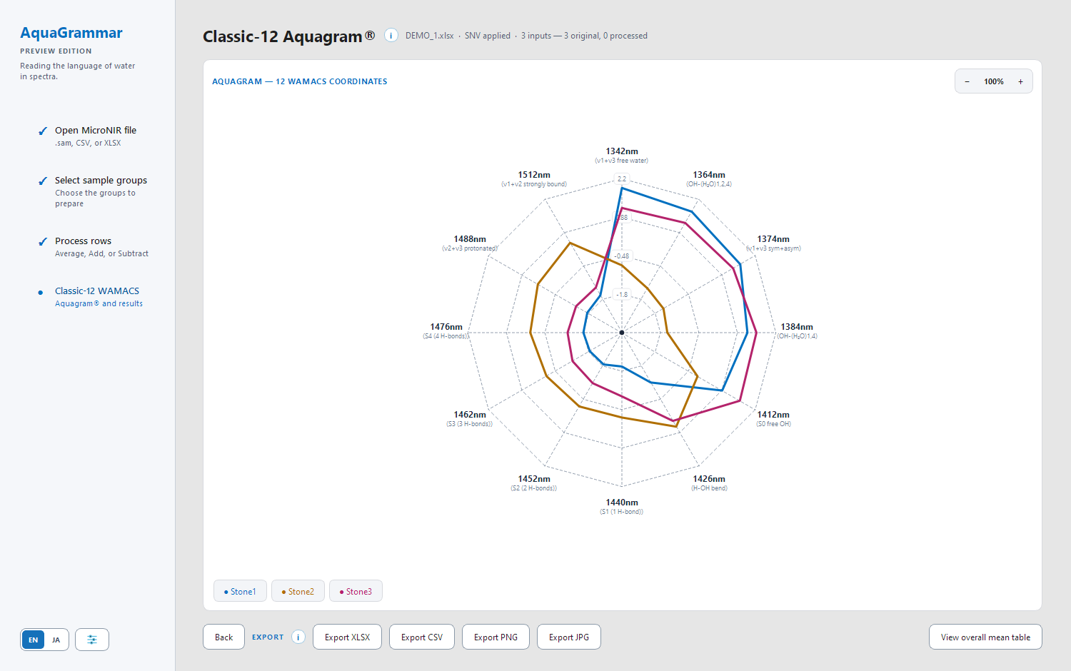
Each ticked row is now one line. Twelve spokes radiate from the centre, one per Classic-12 coordinate, each labelled with its wavelength and what that wavelength is associated with — for example *1412nm (S0 free OH)*.
Reading it. Points further from the centre mean a higher standardized value at that coordinate. The useful question is almost never "what is this line's absolute value" but "where do these lines differ from each other". That is what the shape is for.
Try these:
- Select a legend entry to hide its line, then show it again. Comparing two lines is easier with the third out of the way.
- Zoom with − and +. Above 100% you can drag the chart to pan.
- Hover a line to read the exact coordinate and value under the cursor.
- View overall mean table shows the twelve values averaged across the lines you plotted.
Interpreting responsibly. Describe what differs and where. An Aquagram® does not, by itself, identify a disease, prove a treatment worked, or establish anything about an individual. It is a way of seeing a pattern; the meaning comes from the experiment behind it.
Exporting
Four formats, and the difference matters:
| Format | What you get | Use it to |
|---|---|---|
| XLSX, CSV | One column per plotted line: the WAMACS wavelength, then each line's values | Rebuild the chart in your own tools, or check the numbers |
| PNG, JPG | The chart image together with its legend | Drop into a slide or a document |
These four are the only export formats in Preview.
To start over, click an earlier step in the left rail, or open a different file. Preview does not save projects — when you open a new file, the previous session is replaced.
Check yourself
- What are the four steps, and what does each one produce?
- Why does AquaGrammar average repeats within a group rather than across all your scans?
- Why is 1st overtone the suggested SNV range for Classic-12 work?
- Average needs at least two groups. What does Subtract need?
- Which exports let you rebuild the chart yourself, and which give you a picture?
- Someone shows you an Aquagram® and says it proves a sample is healthy. What is wrong with that claim?
Next
- How AquaGrammar works — what each processing step does
- Glossary — the words used here
- Troubleshooting — if something behaved unexpectedly